Philip Johnson Art Exhibit
This is a typographic case study surrounding Futura. I designed an art exhibit at a local museum which was based off of the architect, Philip Johnson. His style portrayed simplistic design decisions which supported strong structural integrity. I wanted to carry this aesthetic through with a font which carried similar traits. Futura is a classic san serif typeface with simple geometric moves which I felt complimented Johnson’s style. Below are some pieces of collateral promoting the exhibit.
The Collateral
The branding of this exhibit is based off of half of Johnson’s silhouette mixed with a typographic play of his name to produce a whole silhouette. Everything including his iconic glasses are created using the font Futura. I developed a rotating color palette of four colors with green acting as the accent. It is meat to have an eye catching effect. The bold color compliments the simplistic typographic design and helps to express the vastness that was Johnson’s portfolio.
The Process
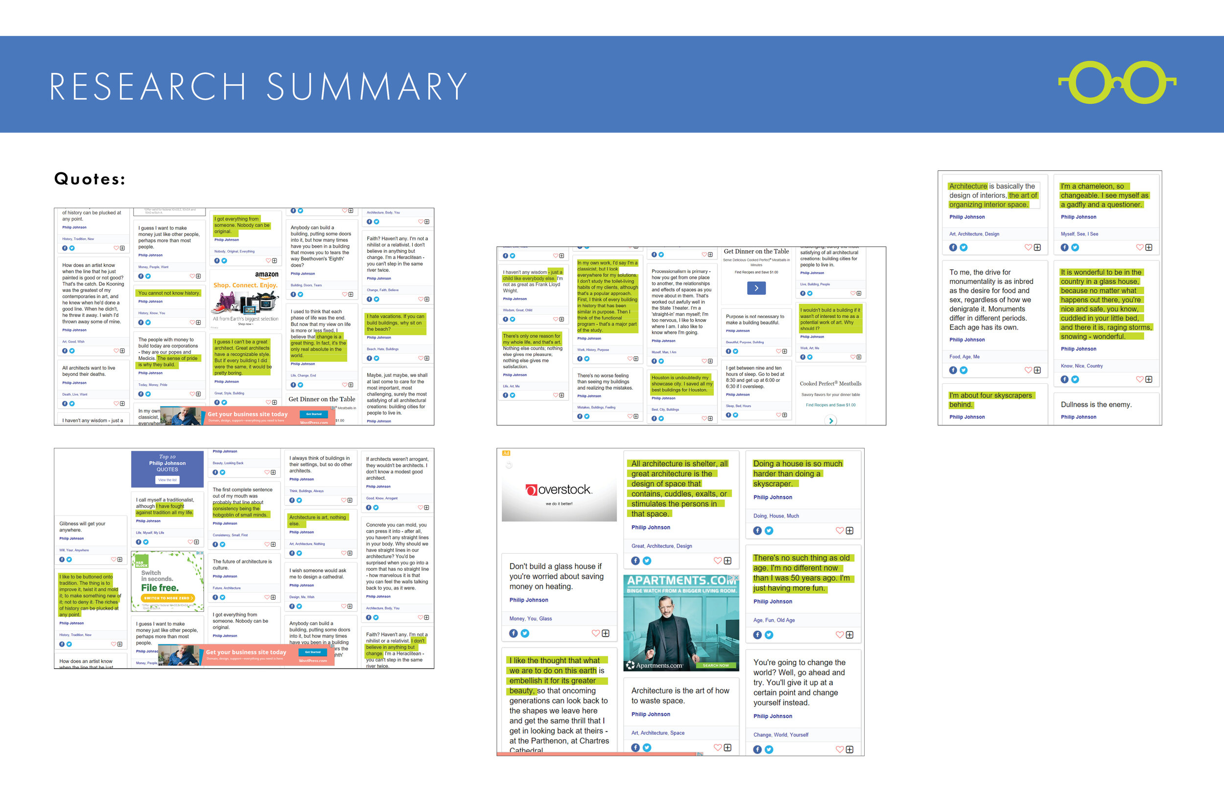
Above is a collection of write ups, quotes, snap shots, and information gathered for inspiration into this project. There is a heavy research section which supports my typical design process. I find having a holistic idea of the content leads to more successful design. I’ve also included sketches as well as the evolution of the designs to show how I went from initial stages to the final design.


